Why Website Navigation Quietly Shapes Conversion Rates
Navigation is one of the most overlooked elements of website performance.
Most businesses treat navigation as a simple organizational tool. It helps visitors move between pages and find information.
But navigation does much more than that.
It shapes how visitors understand your website.
And when navigation is confusing, the entire experience becomes harder to navigate.
Navigation Determines How Quickly Visitors Understand Your Site
When someone lands on a website, they’re trying to orient themselves.
They want to know:
What does this company do? Where should I go next? How do I find the information I need?
Navigation helps answer these questions.
If the navigation menu feels clear and intuitive, visitors quickly understand how the site works.
If it feels cluttered or confusing, visitors may feel lost almost immediately.
And when people feel lost online, they rarely keep searching.
They simply leave.
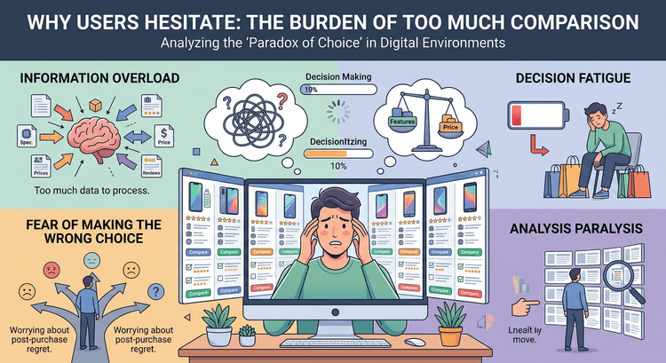
Too Many Navigation Options Create Friction
One of the most common navigation problems is too many choices.
Menus filled with categories, subcategories, and dropdowns may seem helpful, but they often create decision fatigue.
Visitors suddenly have to evaluate multiple paths before choosing one.
This problem connects closely with choice overload, which is explored in Why Too Many Choices Kill Conversion.
When people face too many options, they hesitate.
And hesitation slows progress through the website.
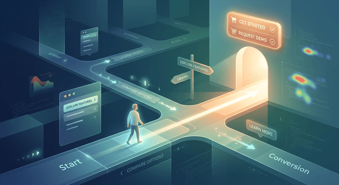
Navigation Supports Conversion Momentum
Navigation isn’t just about moving between pages.
It also supports the flow of the customer journey.
Visitors often arrive through different entry points.
Some come through blog posts. Others arrive from search results or ads.
Navigation helps them discover additional pages that build trust and understanding.
For example:
A blog article may lead to a case study.
A case study may lead to a pricing page.
A pricing page may lead to a contact form.
This progression strengthens conversion momentum, which is discussed in Conversion Momentum: Why Most Funnels Leak Before Pricing.
When Navigation Works, It Feels Invisible
The best navigation systems rarely attract attention.
Visitors simply find what they’re looking for without thinking about it.
The experience feels effortless.
And when experiences feel effortless, visitors are far more likely to continue exploring the site.