Why Users Rarely Read Your Website the Way You Expect
Many businesses assume visitors read their website the same way they would read an article or a book.
They imagine someone landing on the page, carefully reading each paragraph, and slowly working their way down the content before making a decision.
But that’s almost never what actually happens.
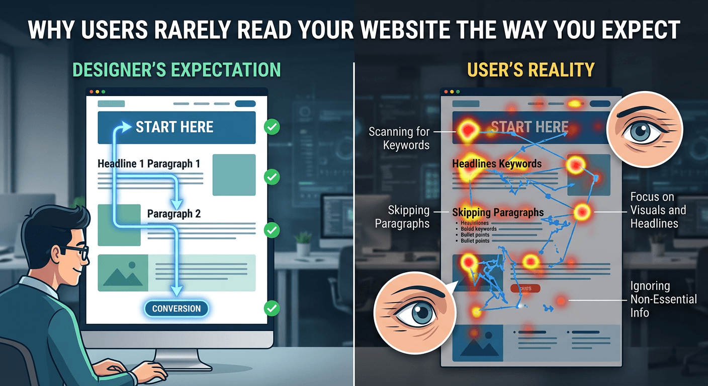
In reality, most visitors scan first and read later.
Their eyes move quickly across the page searching for signals that answer a few immediate questions:
What is this page about? Is this relevant to me? Can I trust this company?
If those answers aren’t obvious within seconds, visitors rarely stick around long enough to read anything else.
The Scanning Behavior of Website Visitors
Research into user behavior consistently shows that people read websites in scanning patterns rather than linear reading patterns.
Instead of moving word by word, visitors jump between visual anchors like:
Headlines Subheadings Buttons Images Highlighted text
These elements help them quickly understand the structure of the page.
When the structure is clear, visitors can grasp the message even without reading every sentence.
But when the page lacks structure, scanning becomes difficult.
And when scanning becomes difficult, visitors often leave.
This is why visual hierarchy plays such a critical role in high-performing websites, something explored in The Hidden Role of Visual Hierarchy in High-Converting Websites.
Visual hierarchy helps guide attention so visitors instinctively know where to look first.
The First Seconds Determine Engagement
Scanning behavior is closely tied to first impressions.
When someone arrives on your website, they immediately begin evaluating the experience.
Is the message clear? Does the design feel professional? Does this seem trustworthy?
This rapid evaluation happens within seconds.
If the experience feels confusing or unclear, visitors often leave before reading anything in detail.
This is why early engagement matters so much, as discussed in The First 5 Seconds: How Users Decide Whether to Stay on Your Website.
Visitors aren’t patiently analyzing your site.
They’re quickly deciding whether it’s worth their attention.
Designing for Scanning Improves Conversions
Websites that convert well usually embrace this scanning behavior instead of fighting it.
They structure information so visitors can quickly understand the page.
Strong headlines introduce key ideas.
Subheadings organize supporting information.
Clear calls to action highlight the next step.
Even if someone only scans the page, they should still understand the core message.
When visitors understand the value quickly, they’re far more likely to continue exploring.
And when exploration continues, the chances of conversion increase dramatically.