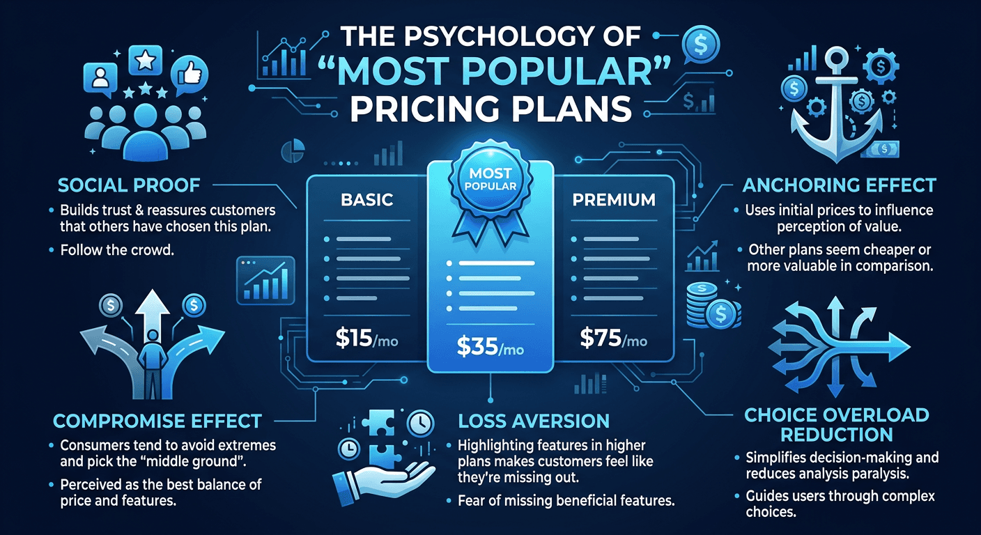
The Psychology of “Most Popular” Pricing Plans
If you’ve ever looked at a pricing page, you’ve probably seen one option labeled “Most Popular.”
It’s usually highlighted. Sometimes it’s slightly larger. Occasionally it’s surrounded by a subtle border or color.
At first glance, this might seem like a small design detail.
But psychologically, it plays a much bigger role than most people realize.
Highlighting a pricing tier acts as a decision shortcut for visitors who aren’t sure which option to choose.
Instead of carefully comparing every feature across every plan, many people naturally gravitate toward the option that appears recommended.
And that small design decision can significantly influence conversions.
Why People Look for Decision Shortcuts
When someone reaches a pricing page, they’re already evaluating several things at once.
Is this solution right for me? Is the price reasonable? Which plan makes the most sense?
Even simple pricing pages require multiple decisions.
Because of this, people often look for signals that simplify the process.
A “Most Popular” label acts as one of those signals.
It suggests that other customers have already chosen this option, which reduces the perceived risk of selecting it.
This behavior is closely related to social proof, which also plays a major role in trust building online.
You can see this principle discussed further in Trust Stacking: The Hidden Multiplier Behind Conversions, where layered credibility signals help visitors feel more confident moving forward.
The Middle Plan Effect
Interestingly, the “Most Popular” plan is often the middle tier on a pricing page.
This isn’t random.
When people are presented with three options — low, middle, and high — they frequently choose the middle option because it feels like the safest balance between price and value.
The lowest plan may feel limited.
The highest plan may feel too expensive.
The middle plan feels like a reasonable compromise.
By highlighting this plan as “Most Popular,” businesses reinforce the visitor’s instinct to choose the middle option.
This concept also connects closely with the strategies discussed in Pricing Page Psychology: Where Conversions Are Won or Lost.
Reducing Uncertainty at the Moment of Decision
One of the biggest reasons people hesitate on pricing pages is uncertainty.
They might wonder:
Am I choosing the right plan? Will this option actually meet my needs? Am I paying too much?
Highlighting one plan reduces this uncertainty.
It acts as a gentle recommendation without forcing the decision.
Visitors still have the freedom to explore other options, but they also have a clear starting point if they feel unsure.
When pricing pages remove this kind of uncertainty, conversions often improve.
When “Most Popular” Doesn’t Work
Of course, simply labeling a plan as “Most Popular” isn’t always enough.
If the pricing tiers themselves are poorly structured, visitors may still struggle to understand the differences between plans.
This is one of the reasons many pricing pages fail to convert effectively.
When tiers feel confusing or overly complex, visitors can’t easily evaluate which option is best.
This issue is explored further in Why Most Pricing Tiers Fail to Convert.
For the “Most Popular” strategy to work well, the pricing structure needs to be clear and logical.
Small Signals, Big Influence
One of the most fascinating things about conversion optimization is how small details influence decisions.
A simple label like “Most Popular” may seem insignificant.
But when visitors are evaluating multiple options and trying to decide quickly, these subtle cues become incredibly powerful.
By guiding attention and reducing uncertainty, pricing pages can help visitors move toward confident decisions instead of hesitation.
And when decisions feel easier, conversions usually follow.