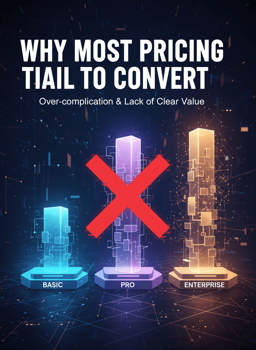
Why Most Pricing Tiers Fail to Convert
Most pricing pages don’t fail because of bad offers.
They fail because of unclear structure.
If you haven’t read Pricing Page Psychology: Where Conversions Are Won or Lost, start there. This builds on that foundation.
Here’s the hard truth:
When pricing tiers look similar, users stall.
And stalled users don’t convert.
The Hidden Problem: Indistinguishable Tiers
Most businesses structure pricing like this:
Tier 1: Basic
Tier 2: Pro
Tier 3: Premium
Feature differences are minor.
Value differentiation is unclear.
So users default to one of two behaviors:
Pick the cheapest
Leave to “think about it”
Neither is ideal.
What High-Converting Tier Structures Do Differently
1. They Segment by Outcome — Not Features
Each tier should solve a different level of problem.
Not just include more features.
Users don’t buy features.
They buy outcomes.
2. They Make the Middle Tier Intentionally Attractive
The middle tier should:
Feel complete
Solve the most common problem
Represent logical value
It shouldn’t feel like a compromise.
It should feel like the smart decision.
3. They Increase Separation — Not Overlap
Overlap creates confusion.
Clear separation creates confidence.
If users struggle to understand the difference, you’ve already lost momentum.
The Psychology Behind the Decision
Users aren’t calculating spreadsheets.
They’re reducing risk.
That’s why anchoring, guarantees, and positioning (covered in the previous article) matter so much.
But structure alone isn’t enough.
The entire conversion journey matters.
Which is why your pricing page must align with your overall UX system.
→ Next: UX Best Practices for Higher Conversions (2026)
Because pricing doesn’t operate independently.
It’s part of a larger decision environment.