UX Best Practices for Higher Conversions (2026)
Most businesses try to optimize isolated pages.
But conversion doesn’t happen on one page.
It happens across a system.
If you haven’t read:
Pricing Page Psychology: Where Conversions Are Won or Lost
Why Most Pricing Tiers Fail to Convert
Start there.
This article connects everything.
Conversion Is Environmental
Users don’t decide in a vacuum.
They respond to:
Clarity
Friction
Trust
Perceived effort
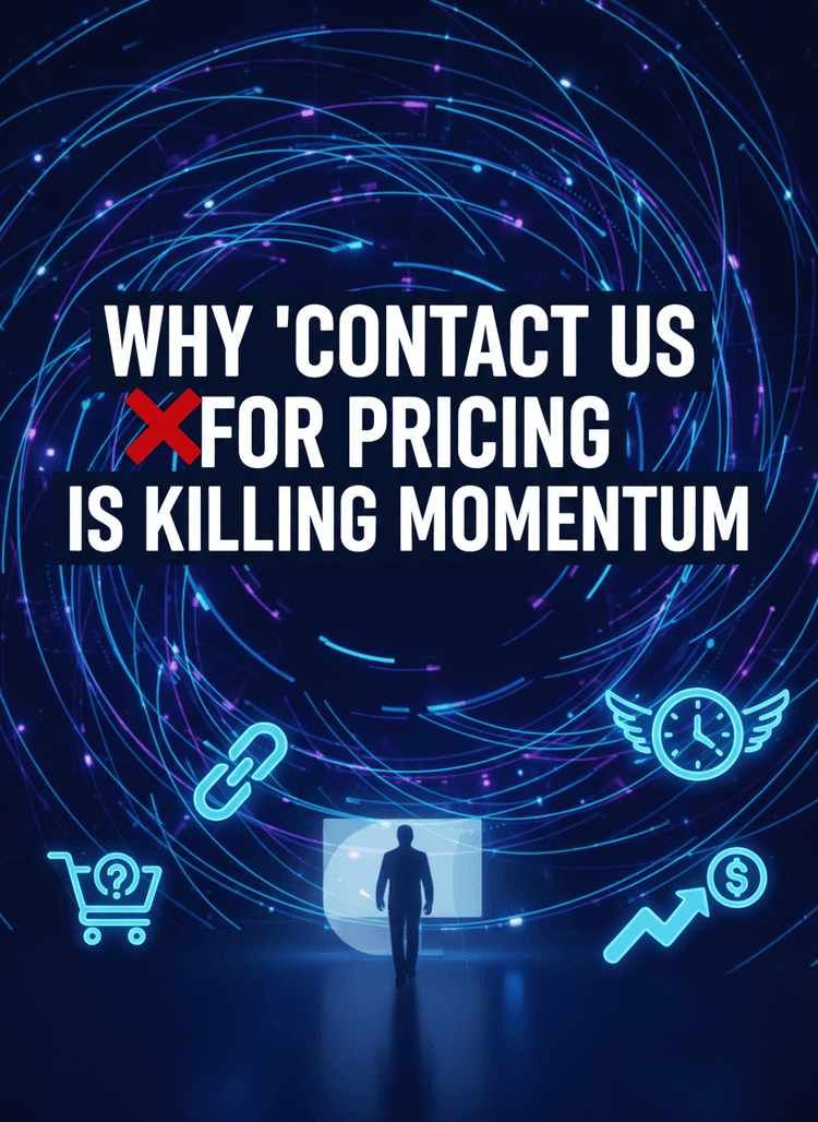
Your pricing page is the final checkpoint.
But the groundwork starts earlier.
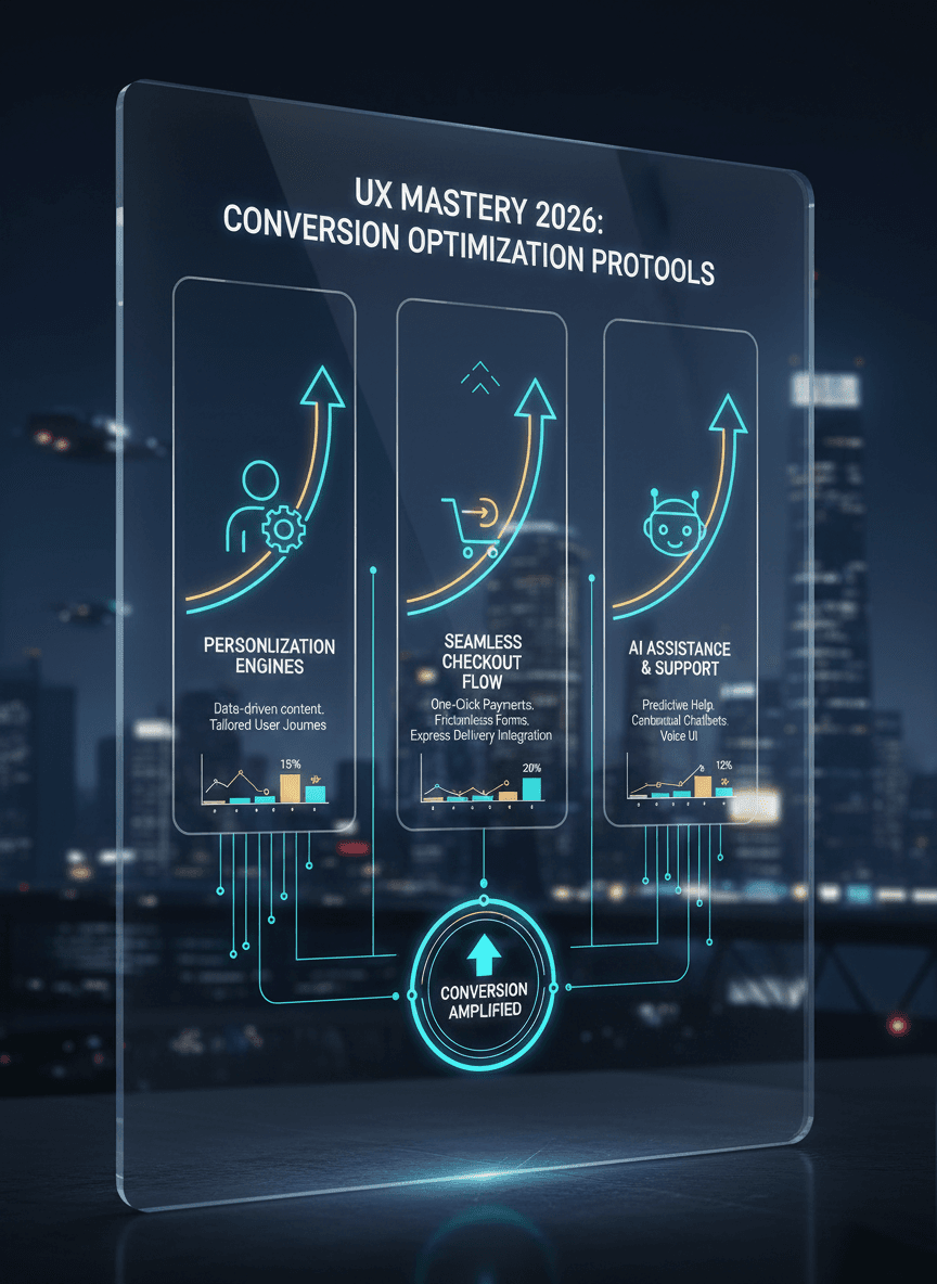
5 UX Principles That Increase Conversion Across the Funnel
1. Reduce Cognitive Load
Fewer decisions.
Clearer hierarchies.
Stronger contrast.
When users think less, they act more.
2. Build Momentum
Every section should move users forward.
Dead ends reduce conversion velocity.
3. Reinforce Trust Repeatedly
Testimonials shouldn’t live on one page.
Trust must compound.
4. Align Messaging With Pricing
If your homepage promises transformation, but your pricing page lists tasks, friction increases.
Consistency builds confidence.
5. Remove Friction at Decision Points
Clear CTAs.
Visible support.
Transparent policies.
Every hesitation point should be anticipated.
The Strategic Perspective
Traffic generation (Local SEO, paid ads, organic content) brings visibility.
UX converts visibility into revenue.
Pricing converts interest into commitment.
These are not separate disciplines.
They are revenue architecture.
And when structured intentionally, they compound.
If you need to revisit the final gate in that system, go back to:
→ Pricing Page Psychology: Where Conversions Are Won or Lost
Because pricing isn’t just presentation.
It’s persuasion.