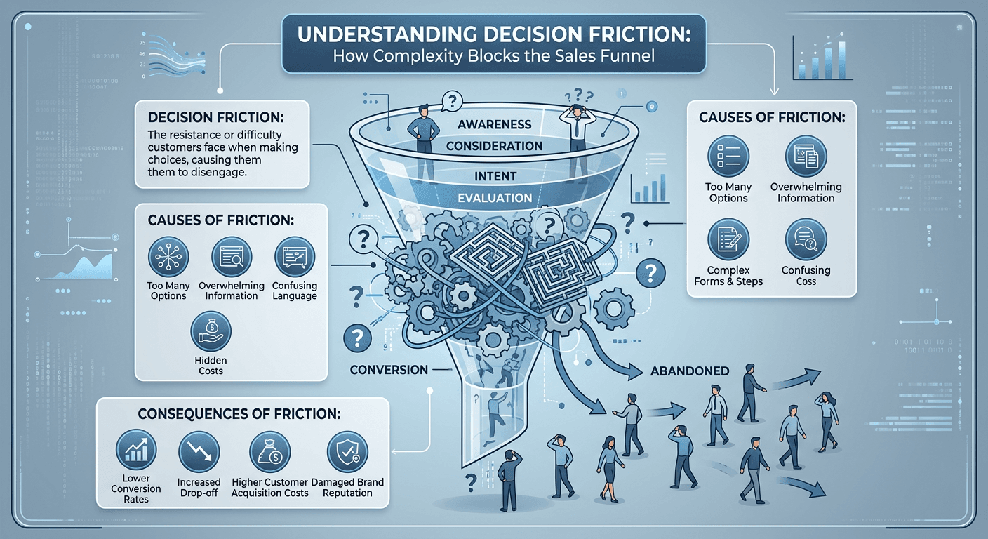
How Decision Friction Breaks Sales Funnels
Most businesses focus on the final step of the funnel.
They optimize the pricing page. They test checkout flows. They adjust the offer.
But the real problem often starts much earlier.
Long before someone reaches the final step, small moments of friction begin to slow the decision process.
And once friction appears, momentum begins to disappear.
What Decision Friction Actually Looks Like
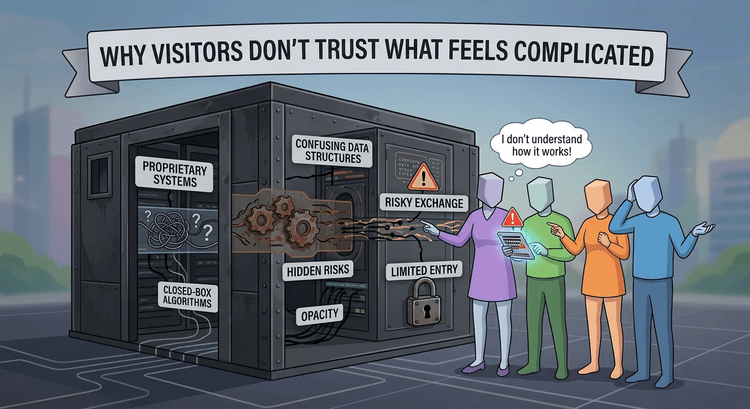
Decision friction happens whenever a visitor hesitates.
It might be something small:
A confusing headline.Too many navigation options. A slow-loading page.
Individually these issues may seem minor.
But together they create hesitation.
And hesitation breaks progress.
Visitors who were initially curious suddenly become unsure about whether they should continue exploring the site.
Momentum Is Fragile
Conversion relies heavily on forward movement.
When someone clicks a link, they’re already moving toward a decision.
But if the next page feels confusing or overwhelming, that momentum disappears.
This is exactly why many funnels lose visitors early in the experience.
The concept is explored in more detail in Conversion Momentum: Why Most Funnels Leak Before Pricing, where small disruptions in the user journey lead to major drop-offs.
Early Friction Has the Biggest Impact
Interestingly, the earlier friction appears, the more damaging it tends to be.
If visitors encounter problems in the first few seconds of the experience, they rarely continue exploring the site.
This is why early impressions — such as page speed, messaging clarity, and visual structure — play such a powerful role in conversion performance.
For example, slow page performance can immediately create doubt in a visitor’s mind. The psychological impact of this is discussed in The Role of Page Speed in Conversion Psychology.
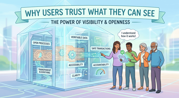
Removing Friction Strengthens the Funnel
The most effective funnels remove obstacles instead of adding complexity.
Clear messaging helps visitors understand the offer.
Simple navigation keeps the experience intuitive.
A strong visual hierarchy ensures visitors always know where to look next.
When these elements work together, visitors move naturally through the funnel without feeling confused or overwhelmed.
And when the experience feels effortless, conversions improve.