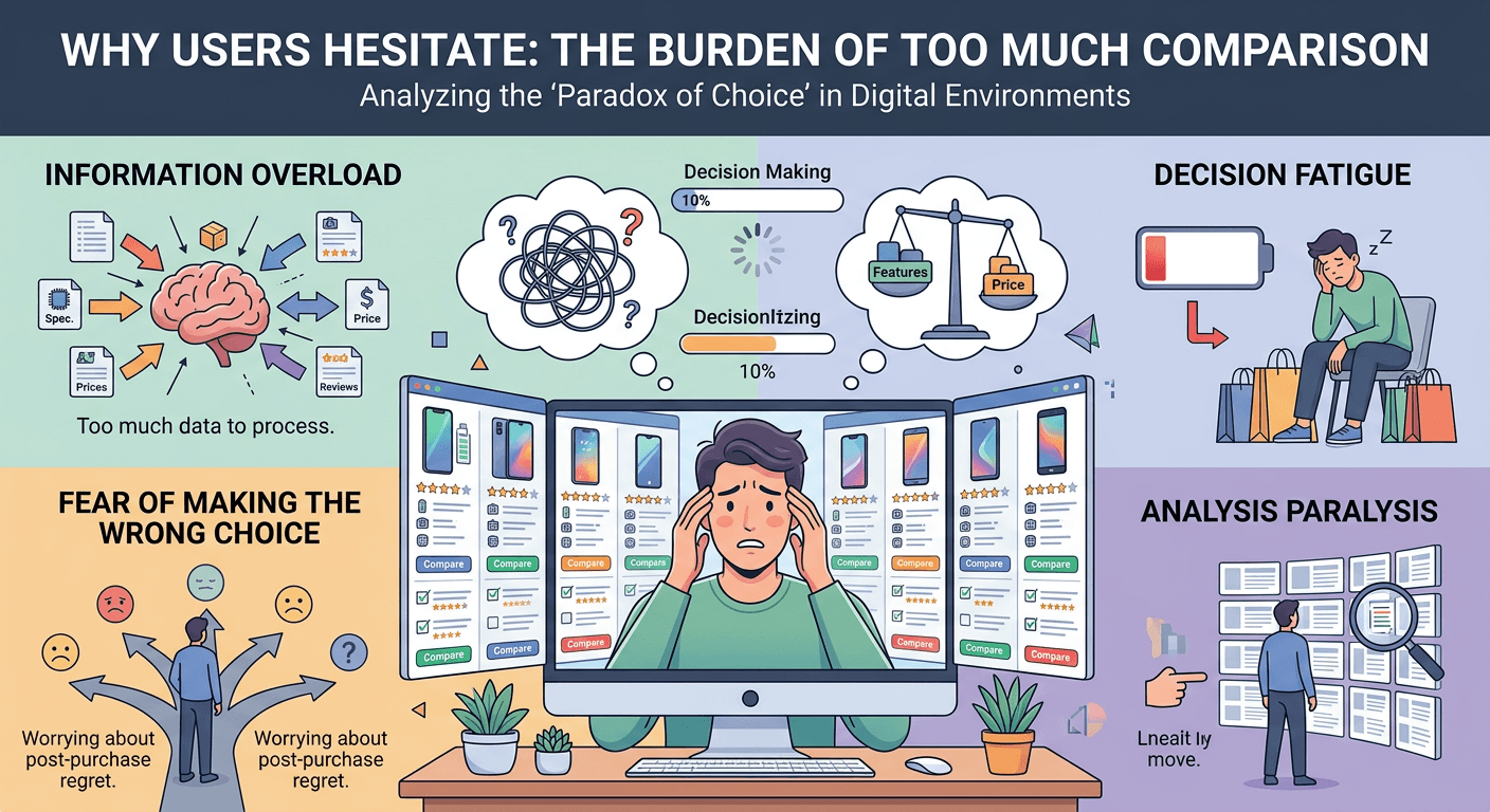
Why Users Hesitate When They Have to Compare Too Much
Comparison is part of every buying decision.
But too much comparison slows everything down.
Comparison Requires Mental Effort
When users compare options, they have to:
Understand differences Evaluate value Make tradeoffs
That takes time and energy.
Too Many Variables Create Friction
A typical pricing table includes:
Multiple plans Dozens of features Small differences between tiers
On paper, it looks helpful.
In reality, it creates cognitive overload.
This Is the Illusion of Comparison
Just because information is presented clearly doesn’t mean users process it.
Most people don’t go line by line.
They scan.
They simplify.
They look for shortcuts.
This connects directly to The Illusion of Comparison: Why Users Don’t Read Pricing Tables.
When Comparison Feels Hard, Users Delay
If evaluating options feels difficult, users don’t push through.
They pause.
And that pause often leads to exit.
Users Want Direction, Not Data
They’re not trying to analyze everything.
They want to know:
Which option makes sense for me? What’s the main difference?
Simplification Speeds Up Decisions
Clear tiers Obvious differences One highlighted option
These reduce the effort required to choose.
This Is Why “Most Popular” Works
It gives users a shortcut.
A signal that reduces uncertainty.
(Connected to: The Psychology of “Most Popular” Pricing Plans)
Reduce Comparison, Increase Conversion
The easier it is to compare, the faster people decide.
The faster they decide, the more likely they convert.
That’s the pattern.