The Illusion of Comparison: Why Users Don’t Read Pricing Tables
Most teams design pricing tables like spreadsheets.
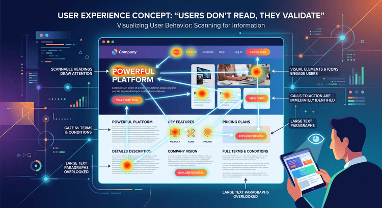
Users don’t read them like spreadsheets.
They scan.
They search for cues.
If you’ve read The Anatomy of a High-Converting Middle Tier, you know differentiation must be obvious.
Here’s why.
The Scanning Behavior Problem
Eye-tracking studies show users:
Focus on highlighted areas
Skim bolded items
Ignore dense rows
If your tiers require detailed comparison, cognitive load increases.
And cognitive load lowers conversion probability.
(See: The Revenue Impact of Reducing Cognitive Load.)
How to Fix Pricing Table Design
Limit rows to core differentiation
Visually emphasize the recommended tier
Group features by outcome, not by tool
Make the decision feel obvious.
Not analytical.
Because analytical decisions slow action.