Why Users Don’t Compare Everything (Even When You Show It)
A lot of pricing pages assume users will compare everything.
They won’t.
People Simplify Decisions
Instead of analyzing:
They scan.
They look for shortcuts.
They reduce complexity.
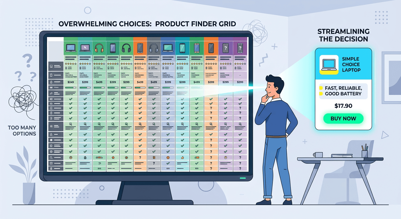
Comparison Tables Are Rarely Fully Read
Even when you provide detailed breakdowns, users don’t go line by line.
They look for patterns.
Differences that stand out.
Signals that guide the decision.
Too Much Detail Slows Everything Down
More rows More features More comparisons
It feels helpful.
But it increases effort.
(Connected to: The Illusion of Comparison)
People Want Direction
Which option is best? What’s the difference that matters?
That’s what they’re looking for.
Clarity Beats Completeness
You don’t need to show everything.
You need to make the decision easier.