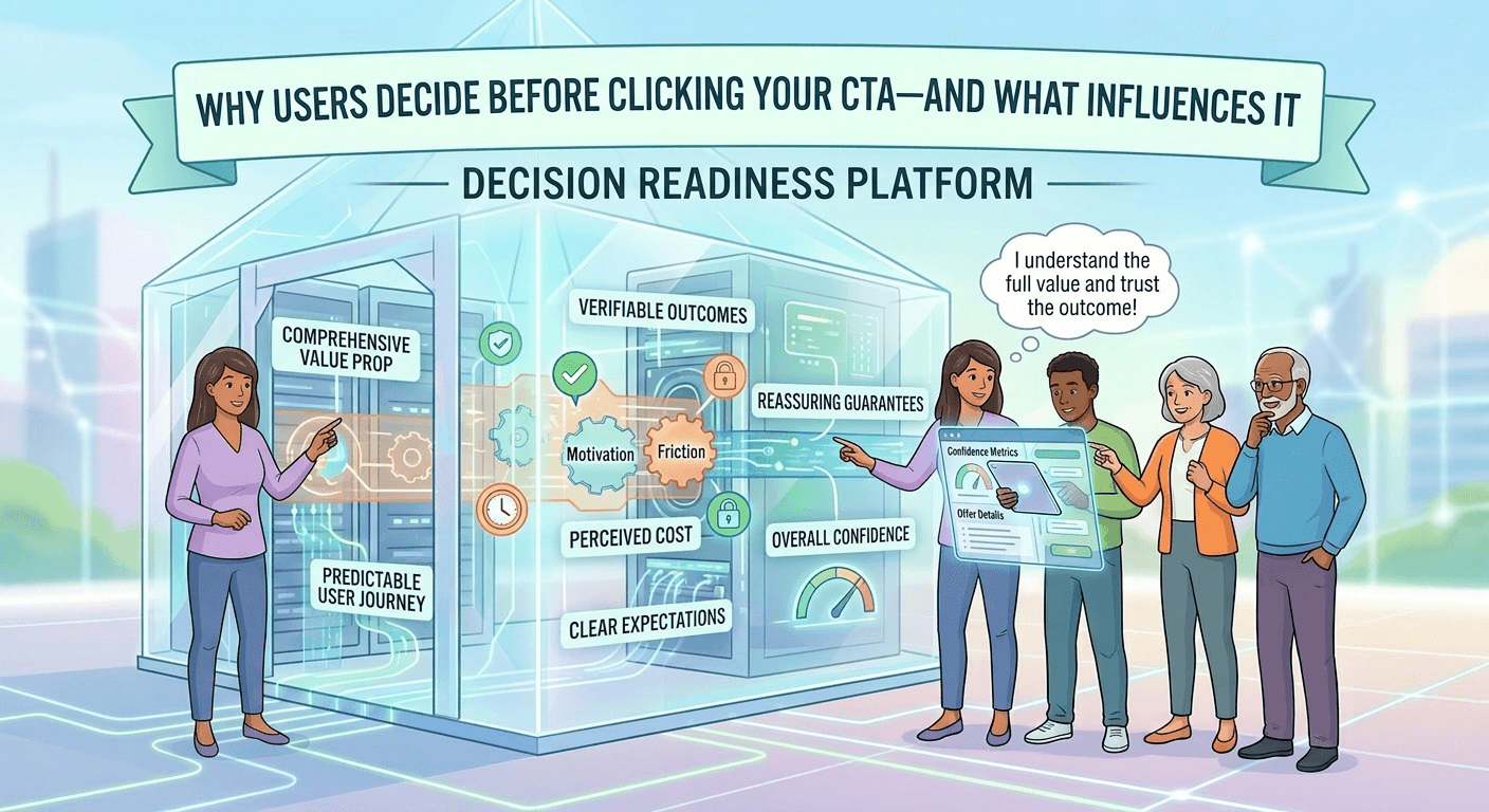
Why Users Decide Before They Click Your CTA
Most people think the call-to-action is where the decision happens.
It’s not.
By the time someone gets there, the decision is already made.
The CTA Is Just the Moment of Action
The real decision happens earlier.
While the user is:
Reading Scanning Evaluating
They’re building a mental conclusion:
“Yes, this makes sense.” or “No, I’m not sure about this.”
The CTA doesn’t create that decision.
It reveals it.
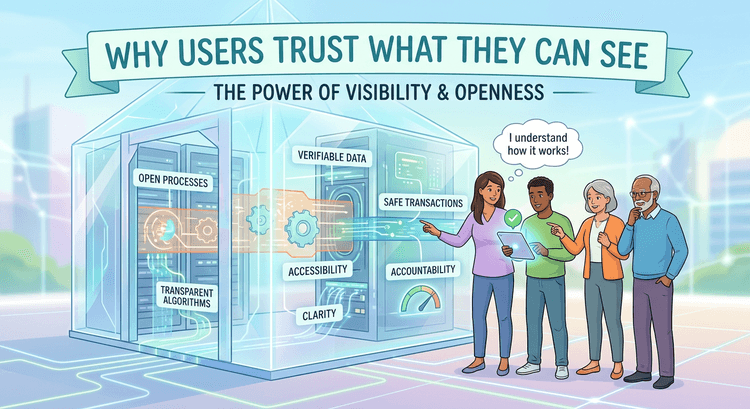
Everything Before the CTA Does the Work
The sections leading up to the CTA determine:
Clarity Trust Confidence
If those are strong, the click feels natural.
If they’re weak, the click doesn’t happen.
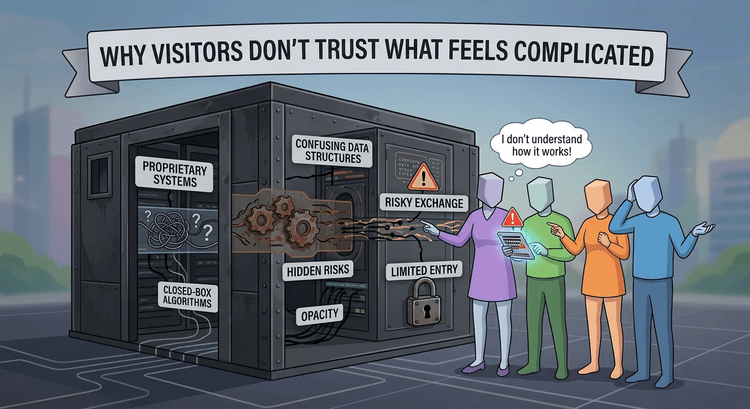
Weak Build-Up Creates Hesitation
If a page doesn’t:
Clearly explain value Show proof Reduce uncertainty
The user pauses.
And that pause is where conversions drop.
This Is Why CTAs Often Get Blamed Incorrectly
Teams change button text.
They test colors.
They tweak wording.
But the issue usually isn’t the CTA.
It’s everything before it.
This connects directly to The Psychology of High-Converting Call-to-Action Buttons.
The button isn’t the strategy.
The experience is.
CTAs Don’t Convince — They Confirm
People don’t click because they were persuaded by the button.
They click because they’re ready.
The decision already happened.
The CTA just gives them a way to act on it.
Placement Matters More Than Copy
Where the CTA appears is just as important as what it says.
If it appears before:
Trust is built Value is clear Questions are answered
It feels premature.
And people don’t click.
Strong Pages Make the CTA Feel Obvious
The best-performing pages guide users to a point where the action feels natural.
Not forced.
Not pushed.
Obvious.
Fix the Page, Not Just the Button
If conversions are low, look at:
Clarity Structure Flow
Because when those are right, the CTA works.
And when they’re not, no button change will fix it.