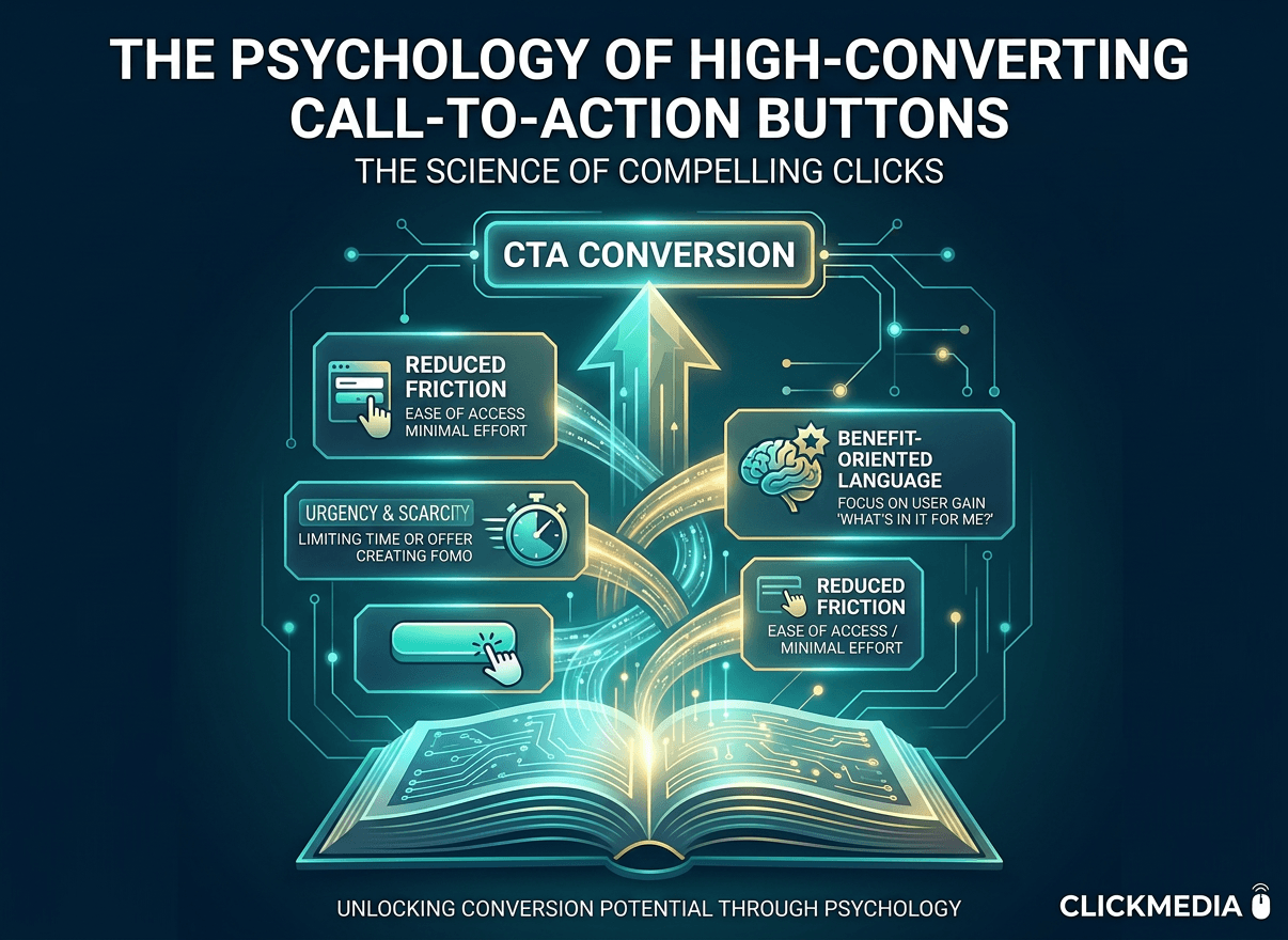
The Psychology of High-Converting Call-to-Action Buttons
In the end, every conversion comes down to a single moment — the moment someone clicks a button.
Call-to-action (CTA) buttons might seem like small design elements, but they play a much bigger role in the decision process.
They act as the bridge between interest and action.
Even small adjustments at this moment can significantly impact conversions.
Clarity Beats Cleverness
Many businesses try to be creative with their call-to-action buttons.
They experiment with clever wording or unusual phrases. But the most effective buttons are usually the simplest ones.
Visitors should immediately understand what will happen when they click.
When that clarity is missing, hesitation increases.
And hesitation slows conversion momentum.
This connects closely to the idea explored in “Conversion Momentum: Why Most Funnels Leak Before Pricing.” Every moment of uncertainty interrupts a visitor’s path toward making a decision.
CTAs Should Match Visitor Intent
Not every visitor arrives ready to buy.
Some people are:
researching
comparing options
close to making a decision
Your call-to-action should match where the visitor is in that process.
For example, someone still researching might respond better to a “Learn More” or “See How It Works” CTA than a “Buy Now” button.
This becomes especially important on pricing pages.
You can explore this idea further in “The 3 Types of Buyers Your Pricing Page Must Address.”
Positioning Matters
Where a call-to-action appears on a page also affects whether conversions happen.
High-converting websites often place CTAs after important trust signals or key information. This allows visitors to build confidence before taking action.
If a CTA appears too early, visitors may hesitate because they don’t yet have enough information to decide.
Thoughtful CTA placement helps guide the decision process, making it easier for visitors to take the next step.