Why People Don’t Read Your Pricing Page (They Scan It)
Most businesses think people carefully read pricing pages.
They don’t.
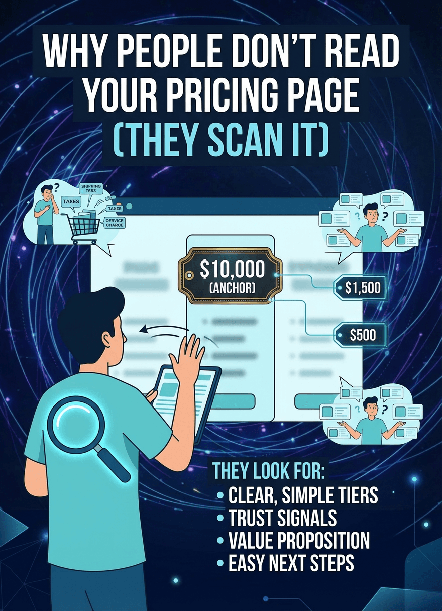
They scan.
Pricing Pages Feel Like Work
When someone lands on a pricing page, they’re not relaxed.
They’re evaluating.
Comparing. Judging. Trying to decide quickly.
So instead of reading everything, they look for shortcuts.
What’s the difference between these plans? Which one makes the most sense? What am I supposed to pick?
If that isn’t obvious within seconds, they don’t dig deeper.
They leave.
The Illusion of Comparison
Here’s the part most people miss.
Just because you show a comparison table… doesn’t mean people are actually comparing.
They glance.
They look for patterns.
They try to simplify the decision.
This is exactly what’s happening in The Illusion of Comparison: Why Users Don’t Read Pricing Tables.
Too much detail doesn’t help.
It slows people down.
People Want the Answer, Not the Analysis
Visitors aren’t trying to analyze every feature.
They want direction.
Which plan is best for me? What’s the difference that actually matters?
This is why “Most Popular” plans work so well.
They remove the need to think too hard.
(Connected to: The Psychology of “Most Popular” Pricing Plans)
Simplicity Wins Here
The best pricing pages don’t try to explain everything.
They make the decision obvious.
Clear tiers. Clear differences. Clear recommendation.
If people have to work to understand your pricing, they won’t.