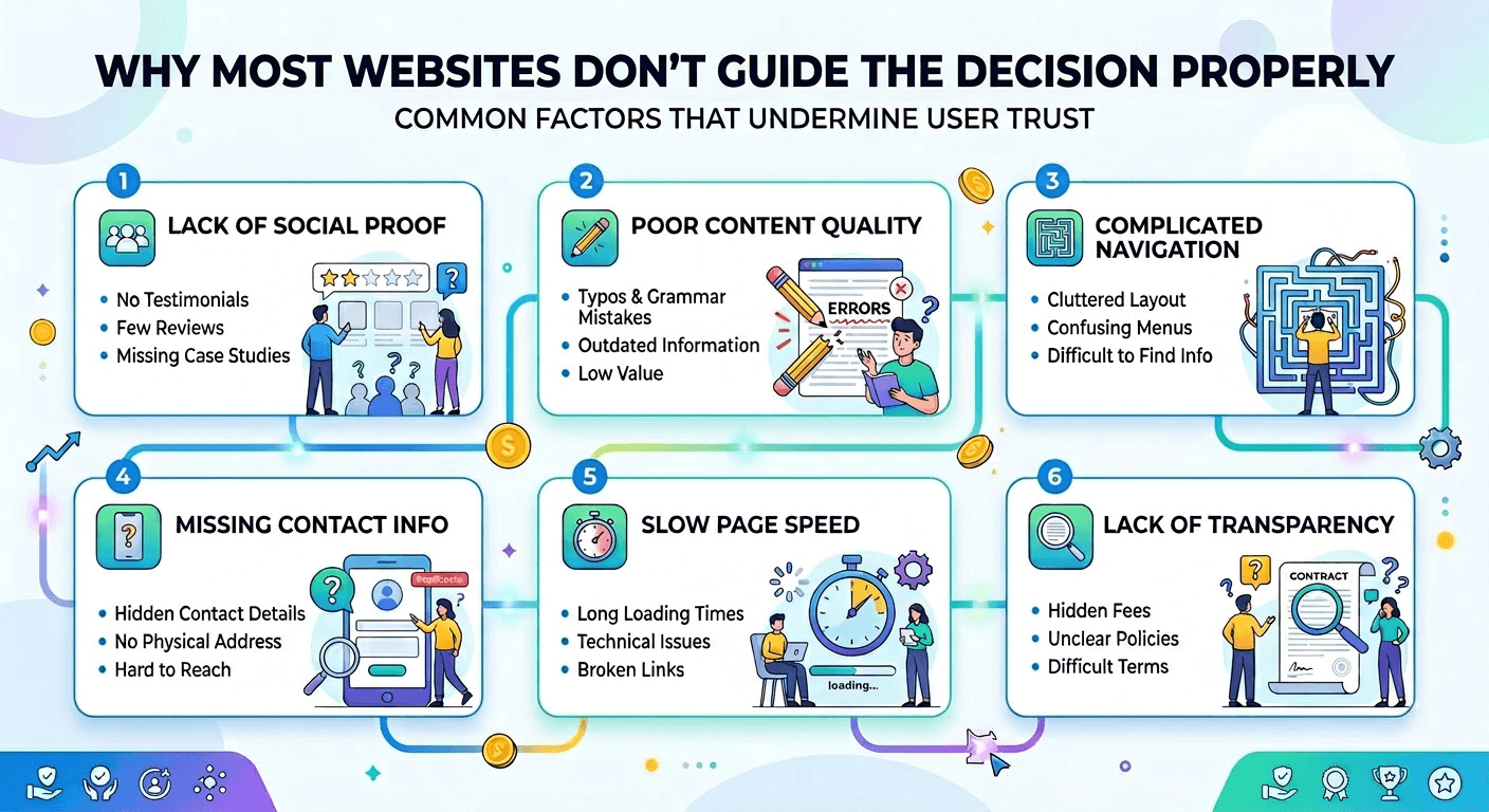
Why Most Websites Don’t Guide the Decision Properly
Most websites present information.
But they don’t guide decisions.
And that’s the difference between browsing and converting.
Information Alone Doesn’t Create Action
You can explain everything perfectly:
Features
Benefits
Process
And still lose users.
Because explanation doesn’t equal direction.
Users Don’t Just Want to Understand — They Want to Decide
They’re asking:
What matters here?
What should I focus on?
What should I do next?
If those answers aren’t clear, they hesitate.
This Is Where Structure Does the Real Work
(Connected to: The Hidden Role of Visual Hierarchy in High-Converting Websites)
Structure tells users:
Where to look
What to prioritize
How to move forward
Without structure, users create their own path.
And that path is rarely efficient.
When Users Create Their Own Path, Friction Increases
They:
Jump between sections
Miss key information
Focus on the wrong things
That slows the decision process.
High-Converting Pages Reduce Decision Work
They don’t just present options.
They guide toward one.
Not aggressively.
But clearly.
This Is the Difference Between Exploration and Conversion
Exploration = open-ended Conversion = directed
Your page should support the second.
Guidance Reduces Cognitive Load
When direction is clear, users don’t have to:
Figure out what matters
Decide where to go
Interpret structure
They just follow the flow.
The Best Pages Feel Like They’re Leading You Somewhere
Without you noticing.
That’s what good structure does.
If the Path Isn’t Clear, People Don’t Move
They pause.
And when they pause, they leave.
Guide the Decision, Don’t Just Present It
Because clarity without direction still creates friction.
And friction is what stops conversion.