Why Your Website Feels Harder to Use Than It Should
Most websites aren’t broken.
They’re just harder to use than they need to be.
And that small difference is enough to hurt conversions.
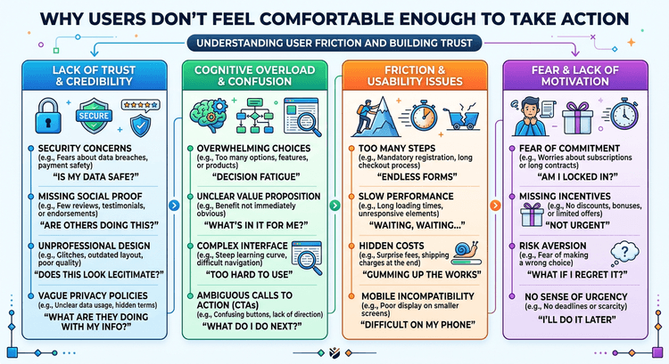
Effort Is the Hidden Problem
Visitors don’t want to work.
They don’t want to figure things out.
They don’t want to think harder than they have to.
Every extra bit of effort reduces the chance they continue.
Effort Shows Up in Small Ways
It’s rarely one big issue.
It’s small things:
Unclear wording Too many steps Slow transitions Cluttered layouts
Each one adds a little friction.
This Is Cognitive Load in Real Life
When a page feels “heavy,” that’s cognitive load.
Not visually.
Mentally.
You feel it when:
You don’t know where to look You’re not sure what matters You have to reread something
This ties directly into Cognitive Load: The Hidden Conversion Killer on Most Websites.
Easier Always Wins
The websites that convert best aren’t always the most impressive.
They’re the easiest.
Easy to understand. Easy to navigate. Easy to act.
Reduce Effort, Increase Action
If you want better performance, ask:
Where is this harder than it needs to be?
Fix that, and everything else improves.