Why Most Pricing Pages Don’t Actually Help People Decide
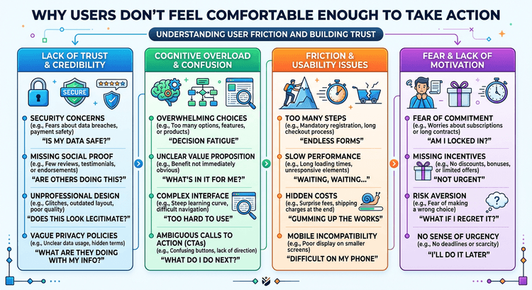
Most pricing pages are built to display information.
Not to help people decide.
And that’s the problem.
Information Isn’t the Same as Clarity
You can list every feature.
Every plan. Every detail. Every difference.
And still leave people confused.
Because information alone doesn’t guide decisions.
It just sits there.
People Aren’t Trying to Study Your Pricing
No one lands on a pricing page thinking:
“I’m going to analyze all of this carefully.”
They want to decide quickly.
Which option makes sense? What’s the difference that matters? What should I choose?
If your pricing page doesn’t answer that fast, they don’t keep analyzing.
They leave.
This Is Where Most Pages Break
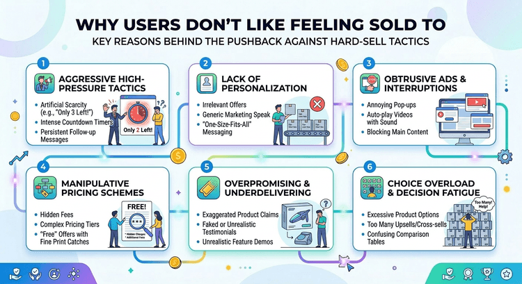
Too many features. Too many comparisons. Too much noise.
It creates the illusion of clarity, but actually increases friction.
This connects directly to The Illusion of Comparison: Why Users Don’t Read Pricing Tables.
People don’t read every row.
They scan for meaning.
Good Pricing Pages Reduce Thinking
High-converting pricing pages do a few things really well:
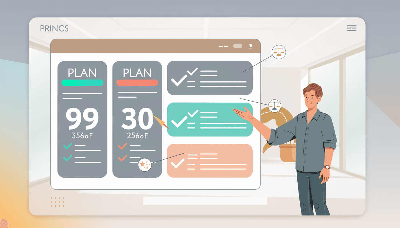
They simplify differences They highlight one clear option They remove unnecessary detail
This is also why “Most Popular” plans work.
Not because they’re clever.
Because they reduce decision effort.
The Goal Isn’t to Show Everything
It’s to make the right choice obvious.
When people understand what they’re choosing, they move.
When they don’t, they stall.