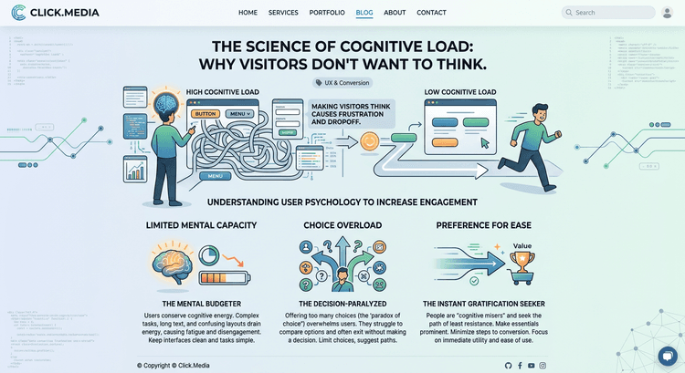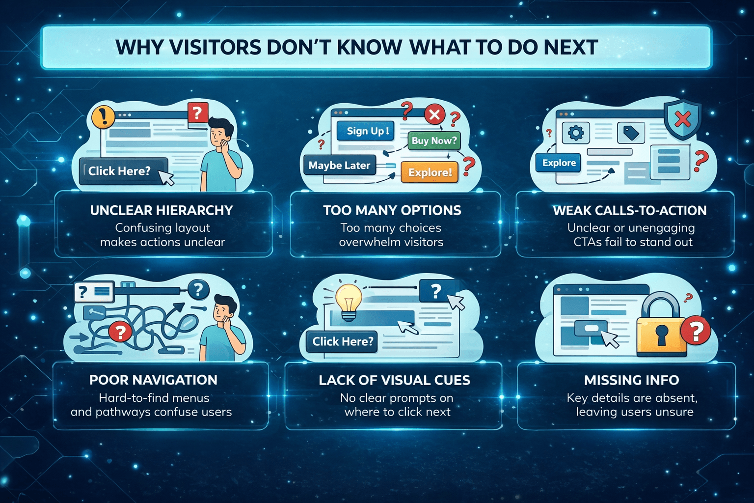
Why Visitors Don’t Know What to Do Next
A lot of websites don’t have a traffic problem.
They have a direction problem.
Too Many Possible Paths
Visitors land on the page and see:
Multiple buttons Multiple sections Multiple options
Nothing stands out.
So they pause.
Unclear Direction Creates Inaction
If someone has to think:
“What should I do next?”
You’ve already lost momentum.
And when momentum stops, people don’t push through.
They leave.
Good UX Removes the Question
High-converting pages make the next step obvious.
Not by forcing it.
By guiding it.
This connects directly to The Hidden Role of Visual Hierarchy in High-Converting Websites.
One Page, One Direction
Every page should have one primary goal.
Not five.
Not three.
One.
That’s how you keep people moving.