Why Pricing Feels Confusing (Even When It’s Not)
A lot of pricing pages are technically correct.
The structure makes sense.
The features are listed clearly.
The tiers are organized logically.
And still… people hesitate.
The Problem Isn’t Logic — It’s Perception
Pricing isn’t processed logically.
It’s processed relatively.
People don’t evaluate each plan in isolation.
They compare.
And that comparison is where things break.
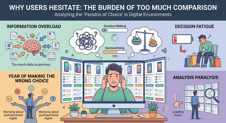
Too Much Information Makes Comparison Harder
Most pricing tables try to be helpful by showing everything.
Every feature. Every difference. Every detail.
But that creates a new problem.
Now the visitor has to process all of it.
And instead of feeling informed, they feel overwhelmed.
This is exactly what’s happening in The Illusion of Comparison: Why Users Don’t Read Pricing Tables.
People don’t carefully analyze rows.
They scan and simplify.
Anchoring Shapes the Entire Decision
The first number someone sees matters more than most people realize.
It becomes the reference point.
Everything else gets judged against it.
So if your pricing isn’t structured intentionally, you’re leaving that perception up to chance.
This connects directly to The Anchoring Effect: Why the First Price Your Customer Sees Matters.
When Everything Looks Important, Nothing Stands Out
Another common issue:
Every plan looks equally important.
Same size.
Same emphasis.
Same weight.
So the user has no signal for what to choose.
And when there’s no signal, they hesitate.
The Goal Isn’t to Show Everything — It’s to Make a Choice Easy
High-converting pricing pages do a few things differently:
They simplify differences They highlight one option They reduce unnecessary detail
Often, that’s the middle plan.
(Connected to: The Psychology of “Most Popular” Pricing Plans)
Clarity in Pricing Reduces Hesitation
When someone understands your pricing quickly, something shifts.
They stop comparing endlessly.
They start deciding.
And that shift is where conversions happen.