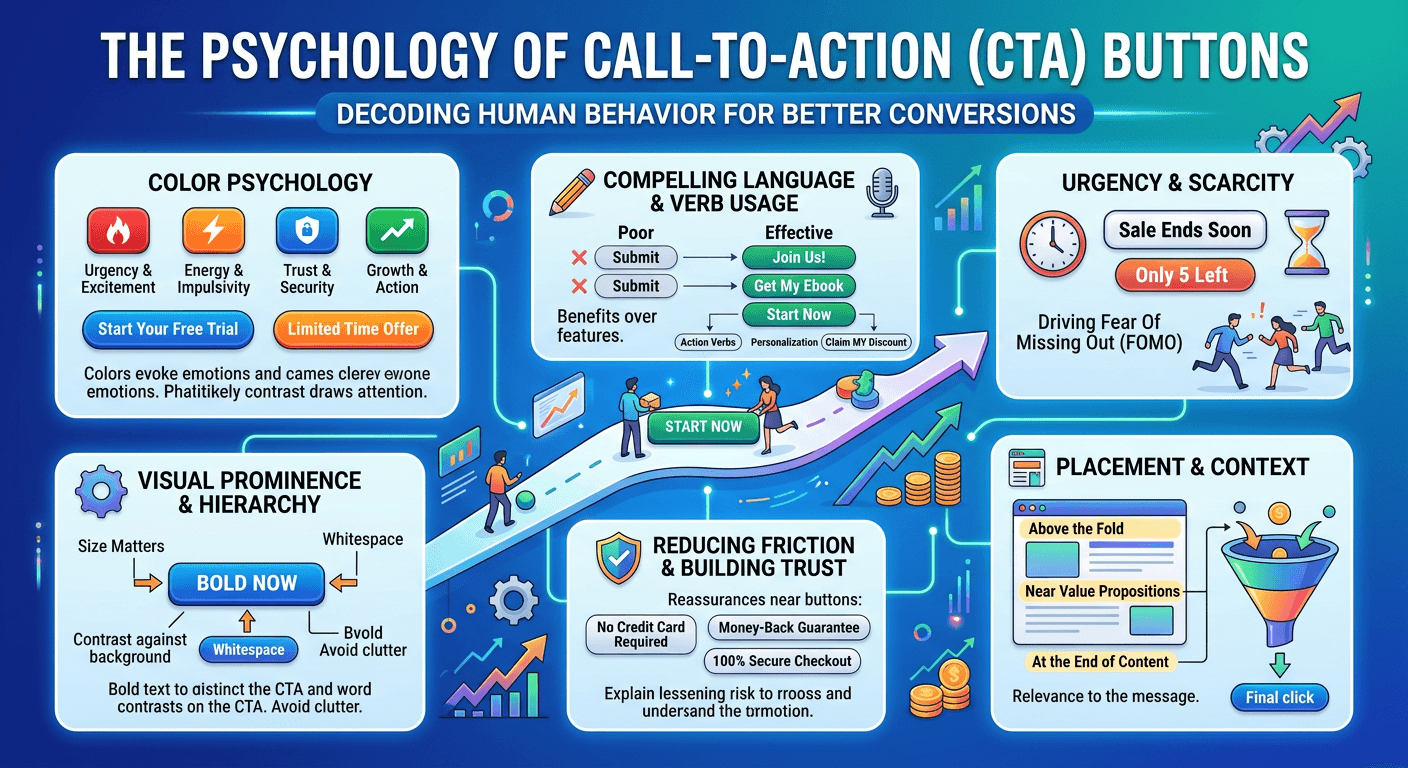
The Psychology of Call-to-Action Buttons
Every conversion eventually comes down to one moment.
The moment someone decides to click.
Call-to-action buttons may look like simple design elements, but they play a powerful psychological role in the decision process.
Clarity Drives Action
Visitors should instantly understand what will happen when they click a button.
Ambiguous phrases create hesitation.
Clear calls to action remove that hesitation.
Examples like:
Start Your Free Trial Schedule a Demo Get Your Quote
Work because the action is obvious.
Placement Matters
Buttons perform best when they appear after key moments of confidence.
After explaining the offer. After presenting proof. After answering common objections.
This placement supports the natural decision process.
It also helps maintain conversion momentum, which is explored in Conversion Momentum: Why Most Funnels Leak Before Pricing.
Design Influences Attention
Color, size, and spacing all influence how noticeable a button feels.
A strong visual hierarchy ensures that the most important action stands out clearly.
This concept is explored further in The Hidden Role of Visual Hierarchy in High-Converting Websites.