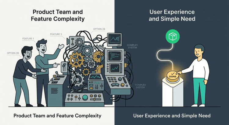
Why Too Many Choices Kill Conversion
Choice seems beneficial.
More options should mean more opportunities for users to find the right fit.
In practice, the opposite often happens.
Too many choices create hesitation.
This is known as choice overload.
Choice Overload and Decision Delay
When users encounter too many options, their brain shifts into comparison mode.
Instead of moving toward action, they begin evaluating differences.
The more comparisons required, the longer the decision takes.
And longer decisions often lead to abandonment.
Where Choice Overload Appears
Choice overload commonly appears in places like:
Pricing tables with too many tiers
Navigation menus with too many links
Landing pages with multiple calls-to-action
Forms requesting unnecessary information
Each extra option forces the user to think harder about the next step.
Simplifying the Path Forward
High-converting websites reduce the number of decisions users must make.
Instead of presenting many choices, they guide users toward the most relevant one.
This often involves:
Highlighting one recommended option
Using a single primary CTA
Structuring pricing tiers clearly
Simplifying navigation
Clarity reduces hesitation.
And reduced hesitation increases action.
Final Thought
More options rarely increase conversions.
Clear direction does.
The easier it is for users to understand what to do next, the more likely they are to do it.