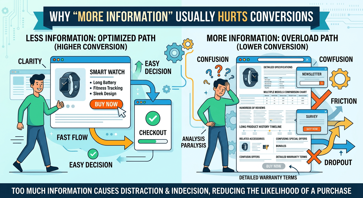
Why “More Information” Usually Hurts Conversions
A lot of websites try to solve conversion problems by adding more content.
More sections. More explanations. More features.
It feels like you’re being helpful.
But most of the time, it backfires.
More Information = More Decisions
Every new section adds a decision.
Do I read this? Is this important? Should I click something else?
The more decisions you introduce, the more effort the visitor has to put in.
And effort is what kills conversions.
This Is Where Cognitive Load Shows Up
When a page feels heavy, cluttered, or overwhelming, that’s cognitive load.
It’s not always obvious.
But you feel it.
You start skimming faster. You lose focus. You stop caring.
This is exactly what’s explained in Cognitive Load: The Hidden Conversion Killer on Most Websites.
Simplicity Feels Better (And Converts Better)
The best-performing pages usually feel simple.
Not empty.
Not minimal for the sake of design.
Just clear.
You know what the page is about. You know what to do next. You don’t have to think too much.
This also connects to Why Simpler Websites Almost Always Convert Better.
Clarity Beats Coverage
You don’t need to explain everything.
You need to explain the right things.
The goal isn’t to give more information.
It’s to remove confusion.