Why High-Converting Websites Feel “Easy”
The best websites don’t feel impressive.
They feel easy.
Easy Means Low Effort
You don’t have to think.
You don’t have to search.
You don’t have to figure anything out.
You just move.
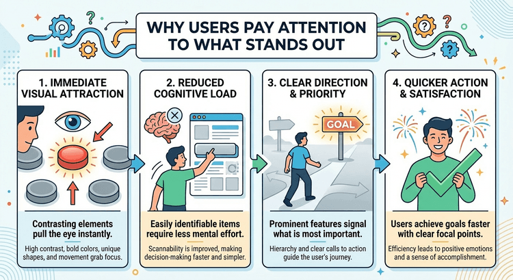
Everything Feels Obvious
You understand what it is instantly.
You know where to look.
You know what to do next.
That’s not accidental.
That’s structure.
Ease Is Built, Not Designed
It comes from:
Clear messaging Strong hierarchy Logical flow
This connects directly to The Hidden Role of Visual Hierarchy in High-Converting Websites.
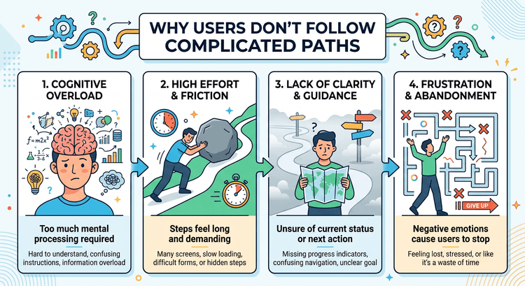
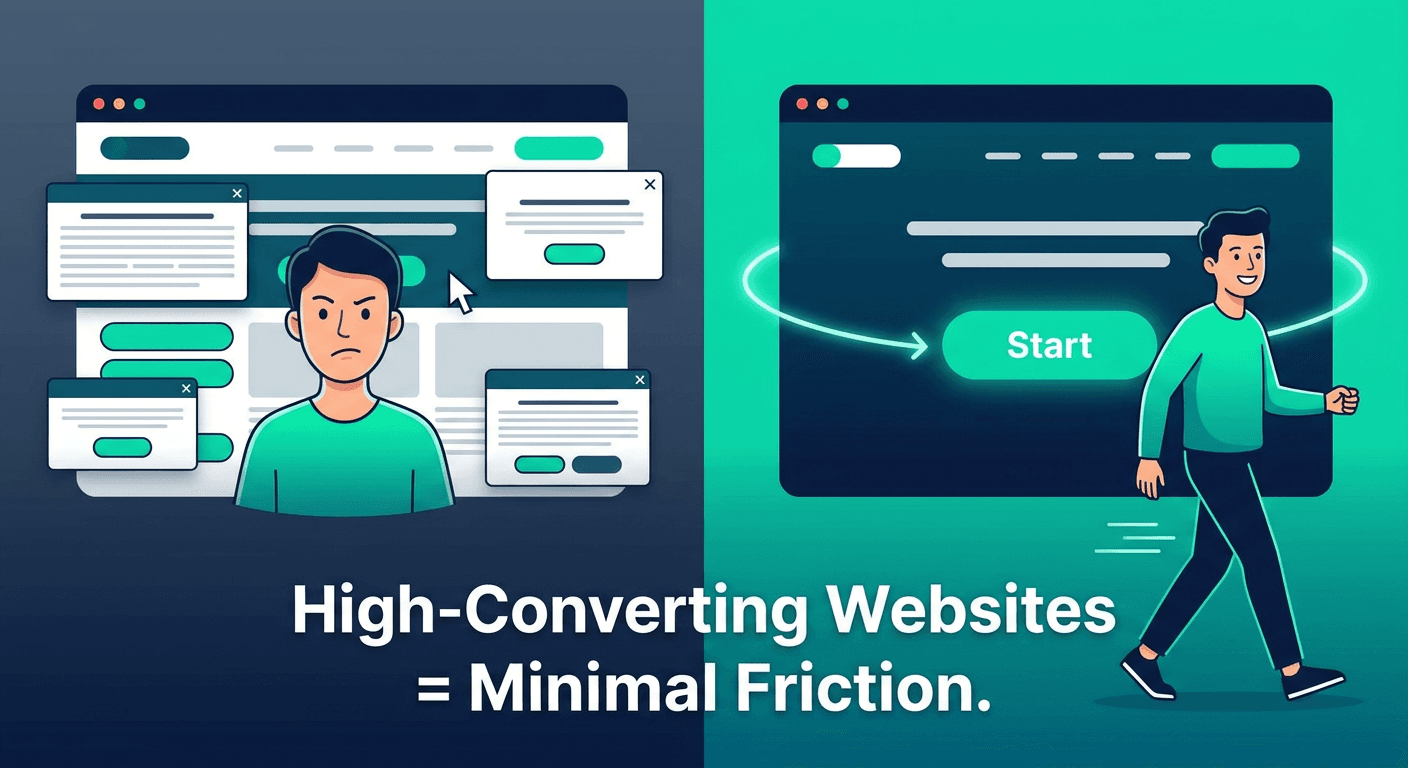
Hard Experiences Don’t Convert
If something feels confusing, people hesitate.
If something feels slow, people disengage.
If something feels unclear, people leave.
Easy Experiences Win
Not because they’re flashy.
Because they reduce resistance.
And when resistance disappears, action increases.