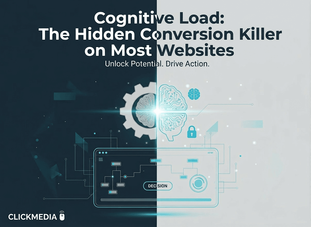
Cognitive Load: The Hidden Conversion Killer on Most Websites
Sometimes the biggest conversion problem isn’t what’s on a website.
It’s how much the visitor has to think.
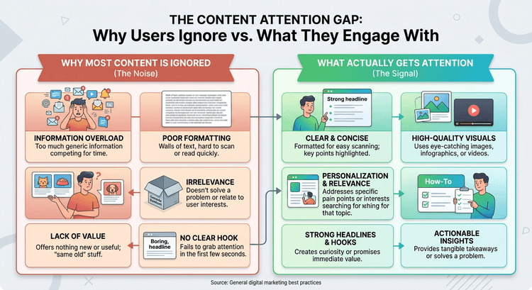
When a website presents too much information, too many options, or too many decisions at once, the brain becomes overloaded.
And when that happens, people often leave instead of deciding.
This phenomenon is known as cognitive load, and it’s one of the most overlooked problems in conversion optimization.
The Brain Wants Simplicity
Human brains naturally prefer simple decisions.
When information is clear and organized, people move forward easily.
But when a page feels crowded or complicated, the brain has to work harder to process everything.
Visitors may find themselves wondering:
Where should I click? What should I read first? Which option is best?
When these questions pile up, decision fatigue begins.
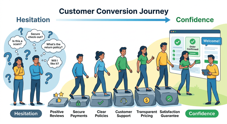
Too Many Choices Create Friction
Choice overload is a perfect example of cognitive load.
When visitors are presented with too many options, the decision becomes harder instead of easier.
This is exactly why reducing options can improve conversion rates.
You can see this dynamic explained in Why Too Many Choices Kill Conversion.
Good UX Reduces Thinking
High-performing websites are designed to reduce mental effort.
Information is organized clearly. Key actions stand out. Visitors always know what to do next.
When users don’t have to think as much, they move through the experience more smoothly.
This approach aligns closely with many of the principles discussed in UX Best Practices for Higher Conversions (2026).
Simplicity Creates Momentum
The less effort it takes to understand a website, the easier it becomes for visitors to continue exploring.
And when exploration becomes effortless, conversions tend to follow naturally.